By Boyce Thompson
Sticking to a budget starts with picking a plan that won't cost you a ton of money to construct, both in terms of materials and labor. But if you're not an experienced home builder, it can be hard to pinpoint which designs will be easy to build. Some home features – foundation bump-outs, elaborate roof lines, and empty hallways, to name three – may add expense without creating much aesthetic value.
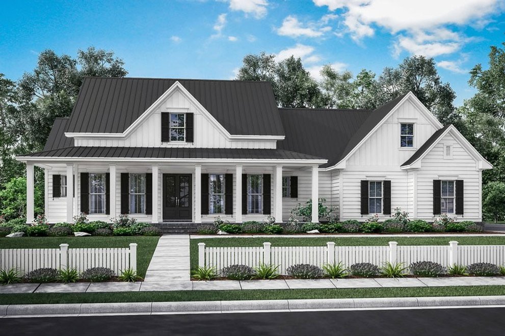
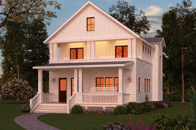
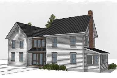
You are probably better off spending that money on great exterior materials and interior design touches that create real character. House builders who repeatedly construct homes from house plans know what to look for. They look for plans with rooms that borrow space from each other and make the most of exterior views. They also know that some house plan firms sweat construction details more than others. For some firms, it’s their reason for being. “We are very passionate about keeping the cost per foot to build to an absolute minimum,” says Jonathan Boone of House Plan Zone, based in Hattiesburg, Miss. See an example of their signature sleek farmhouse look with Plan 430-160, above.
One big reason for the firm’s attention to detail is that construction cost overruns can derail the financing for your project. Most banks will lend only 80 percent of the value of your new home, based on an independent appraisal. If the number comes in high, you may have to dig into your pockets for extra cash to put in the deal. This is especially problematic in parts of the country that haven’t fully recovered from the housing crash. “Appraisals are tough to come by in many parts of the country,” says Boone.
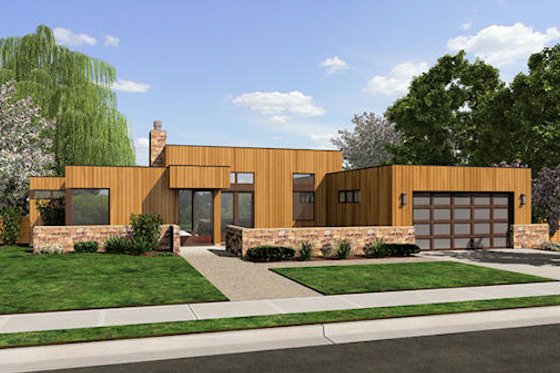
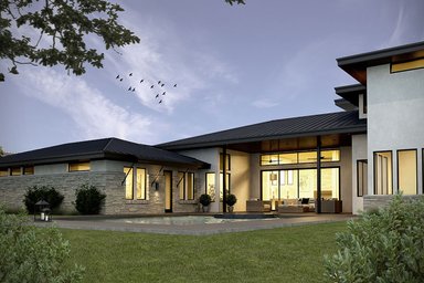
First, take a look at the style of home that you like and decide whether it can be pared down and still stay true to the architectural look. A steeply sloped roof may be essential to pull off a Tudor design. But a shallower roof pitch may work better on other homes, particularly if you are building in a climate where it doesn’t snow often. Your money may be better spent on eaves or awnings that keep the sun from penetrating key rooms on hot days. Plan 48-505 from Alan Mascord Design Associates, above, features cool contemporary styling with simple roof planes.
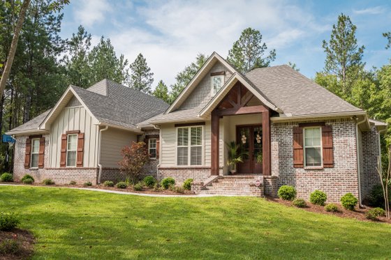
Craftsman-style plans may demand more details than others, but a few, judiciously located ones can go a long way. Consider plan 430-99, above, from House Plan Zone. Key details at eye level – wood columns, wood headers over windows, and a front porch – provide an Arts and Crafts personality. Otherwise, straight lines in the foundation walls make the home inexpensive to build. It’s all about spending money where it matters. “The plan has great curb appeal on the front. But once you turn the corners, it is very simple to build,” says Boone. “What makes it simple? Few roof cuts, lower roof pitches, and fewer offsets.”
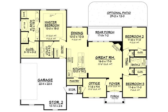
Inside, the home reads larger than its modest 1,769-square-foot size because of attention to key views. Visitors look from the foyer on a diagonal across the great room, through large windows, to a porch in the distance. The view from the kitchen island, where you will doubtless spend lots of time, is carefully considered as well. Building a simple, smaller home leaves you more money to design a distinctive fireplace surround in the corner of the great room. In other plans, you may have money left over for a floating stairwell or an enlarged kitchen island with guest seating and a wine chiller.
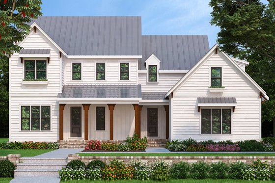
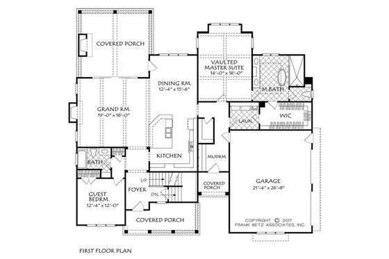
This plan, design 927-981 by Frank Betz Associates, a firm that cut its teeth designing homes for builders, contains all the elements you’d expect on a contemporary farmhouse, especially the bright white clapboard siding and a standing seam metal roof. Extraneous details are kept to a minimum. Clapboard siding, used in a vertical orientation so that it’s in line with the standing seam metal roof, adds character to the entry without adding expense. The same goes for the symmetrical placement of key windows. Good architecture doesn’t have to cost more.
Once again, the designers paid rapt attention to the view upon entering the house – through the great room with sliding patio doors to the porch and beyond. Inexpensive changes in ceiling heights, floor treatments, and wall textures denote zones within the great room. “You can take a small house, open it up, and make it feel much larger,” says Todd Jenkins of Frank Betz. “Usually you want a direct line of sight as you enter rooms throughout the house creating a feeling of openness.”
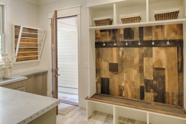
Another important exercise is to think about spaces and features you will really use as opposed to ones that are just nice to have. Hallway space in the Betz plan is kept to an absolute minimum, leaving room within the footprint for a mudroom and laundry. “People want to feel they are getting as many features as possible for a good price. Most of our clients will sacrifice the size of bedrooms to pick up a walk-in pantry or a small office,” says Boone.
Because windows are one of the most expensive elements of a house design, it’s important to use them strategically. It makes sense to economize on windows that wouldn’t provide much of a view – particularly if they will face west and overheat the house – and spend your money on spots where great views will make a big difference, like the view from your bed. Rooms feel better with windows on two sides to promote cross breezes. Corner windows make a room feel larger by erasing the corner visually.
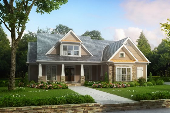
Many home designs today rely on a combination of exterior materials, which can certainly save money compared to using brick on four sides. Using two exterior materials can add contrast and color to your home, even while it saves you money. For example, plan 927-4 above (also from Frank Betz Associates) features an exterior with tons of texture and depth. Just keep in mind that some exterior materials want to be used in certain ways. Stone, even if it’s cultured, looks better closer to the ground, so that it appears structural. Using too many different exterior materials creates confusion and adds expense.
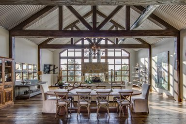
The savings can go into interior details that you’ll appreciate day in and day out. Timbers, for instance, add texture and visual interest to a vaulted ceiling. Stone, tile, or brick floors in the laundry or mudroom may be easier to clean and maintain. Floating vanities not only make a bathroom read larger but make it easier to change flooring later. Using exterior siding on an interior wall – shiplap siding is a current favorite – ties together a home design.
See some of our favorite designs with Editors' Picks House Plans
